
In this article, we will be looking at the Cause and Effect chart. We’ll also provide a review of the associated process, how it can help in business and how to create a cause and effect chart. Finally, we’ll look at some examples and how it’s used as well as some issues to look out for when using the tool.
Cause and effect definition
Firstly let’s take a look at the definition of cause and effect and how it can be useful to us. Dictionary.com defines cause and effect as “noting a relationship between actions or events such that one or more are the result of the other or others.” What does this mean in practice?
The Cause and effect tool is typically used to help explain what has happened as a result of inputs or what could happen and as such can be used in various contexts such as problem-solving or planning.
It’s a commonly used tool and is widespread in problem-solving tools like 8d.
Cause and effect process.
Before we start with the cause and effect chart let’s take a look at the process.
As with all processes, there are a series of steps – these are:
- Identify the effect (i.e the problem)
- Brainstorm/or use a tool to derive the causes
- Map out the cause and effect chart
- Assess the results and derive an action plan.
Before you start with producing a cause and effect chart it’s worth considering the various permutations of cause and effects, e.g. you could have 1 cause with various effects, you could have various causes and 1 effect, you could have various causes and various effects.
When brainstorming the inputs to your cause and effect chart it’s worth considering the language used when describing the cause as this can help you decide on an optimum format when you come to map them out. For example, take a look at the following:
- Contributes to (i.e. one of many)
- Results in (i.e. a significant result)
- Assists with (i.e. one of many)
- Brings about (i.e. key reason)
- etc
Mapping out causes is usually done so as part of a team-based activity, i.e. brainstorming. You might choose to brainstorm in advanced, putting the end results into the chart or perhaps use the chart while your brainstorming, completing it as you go along.
Cause and effect chart
A cause and effect chart provides a graphical representation of the relationship between causes and effects.
It usually provides the results, graphically, in a linear fashion that takes the inputs displays how they flow into an output.
There are a variety of methods used, and we’ll show some of them below.
Example 1
This is a simplified cause and effect chart that shows a singular relationship between one cause and one effect.

Example 2
This example is what is commonly referred to as a fishbone diagram.
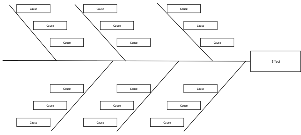
Example 3
This example extends the fishbone diagram and groups related causes together. There are various thoughts on how the groups can be constructed, a common example is to use the following:
- Management
- Equipment
- Material
- People
- Process
- Environment
However, the final groups are down to you and what you think best serves your process.
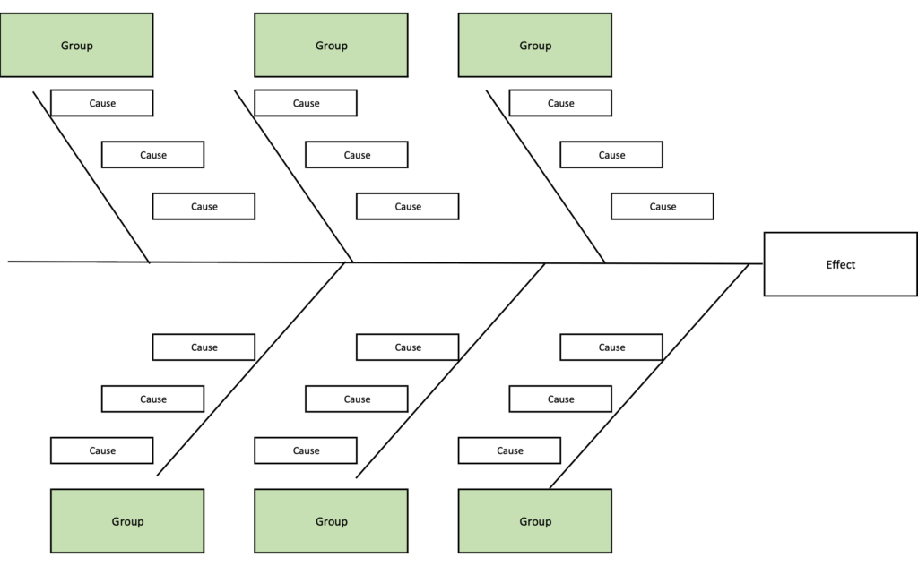
Example 4
This example shows one cause related to multiple effects.
While the fishbone diagrams are more commonly used, all of these have some use depending on the circumstances. I am a fan of the 1 cause to many effects as it drives the user to consider the wider implications of the issues raised.

How to create a cause and effect chart using excel
Luckily, creating a cause and effect chart in Excel is fairly easy. using the examples above we’ll look at how to create example 1 – the simplified cause and effect chart & Example 3 the extended fishbone analysis example.
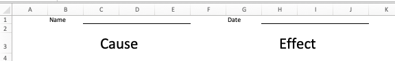
Example 1 – how to create a simplified cause and effect chart
As you can see from the screenshot above showing the 4 examples this one can be used, for example, as a handout/worksheet in a problem-solving investigation.
You don’t need any fancy formulae for this and it can be created using simple cell formatting alone.
1/ First step is to toggle the gridlines to off on the view menu

2/ Now create the header. In this example, we’ve just got a Name & Date (you could expand yours as required). We’ve just used a cell for the title and then used the borders tool to create an underline effect on the 3 cells to the right.

3/ We’ve then created a header section for the “Cause” & “Effect” (note we’ve increased the font size here to “29”. We’ve merged 3 cells for each header column.
4/ Now create the boxes. To do this we’ve merged cells 7 rows and 3 columns wide to shape a box and then used the border tool to create the lines required.
5/ We’ve then used the “insert-shape” tool to insert an arrow to the immediate right of the cause box. We’ve then Copied the “cause” box and pasted it to the right of the arrow.
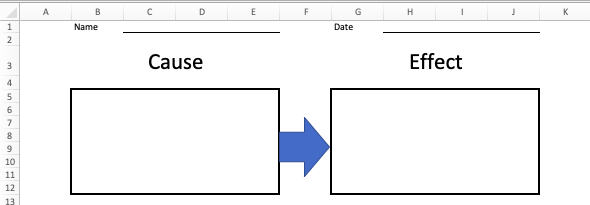
6/ We’ve then simply Copied the two boxes and the arrow and then pasted it below as many times as we thought useful. This gave us 5 rows on the template.
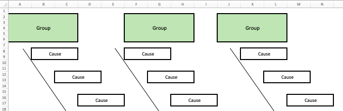
Example 2 – Grouped Decision tree – cause and effect chart.
As per example 3 above this example creates a “tree” style diagram that groups causes together and flows them into a single effect.
Once again you don’t need any fancy formulae you can just use formatting and shapes to create the worksheet.
Here’s how we did it. Note the screenshot below includes the cell references so you can see what boxes span which cells.
1/ Toggle gridlines to off on the View menu option
2/ Create the top row of “Group” boxes (note we’ve shaded these a separate color than the boxes to be used as causes). They are 5 rows deep and 3 columns wide.
3/ Create the causes boxes – these are just two cells together to form a box (with borders added) in excel spaced out to meet the requirements of the “tree style” shape. You can see from the screen shot below which cells we used.
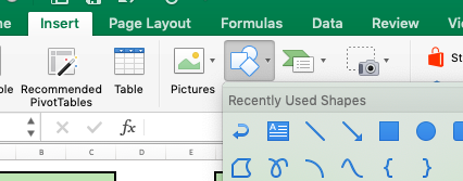
4/ We’ve then used the Insert –> Shape menu option to insert lines that we’ve dragged and extended to form the Tree style format
5/ We’ve then created an “effect” box by merging 5 cells deep 3 wide at the end of the “tree” and then added borders around it.
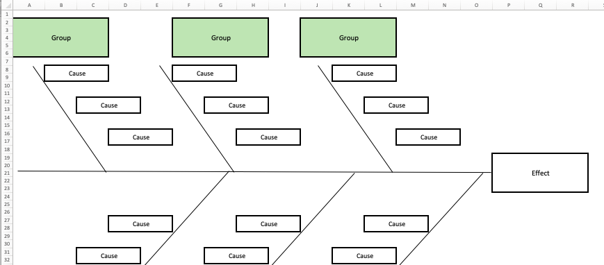
In this example we’ve only used 3 effects per group – you could extend that to many more if required.
How cause and effect charts are used in business
As we explained in our introduction cause and effect is a tool that is often used in problem-solving and problem-solving is all about understanding the chain of events that has resulted in a particular outcome. Having a standardized tool to do this offers a methodical method that can flow out to the organization and used as part of a problem-solving toolkit.
It can also be looked at from the other perspective. You can also use cause and effect tools to brainstorm and decipher positive results. For example, you might want to understand how a project exceeded its expectations by delivering early and under budget. Cause and effect can be used to understand what actions/steps were made that resulted in a positive outcome. Once fully understood those actions can be duplicated into other similar areas of the business to capitalize on best practice.
Whilst many cause and effect tools usualy utilize only a single effect it’s worth considering how a single effect can often lead into a multitude of others and whether or not they relate to a particular cycle.
Let’s say your project is running late, this might have several consequences
- Resources may not be released onto other proejcts
- Costs may increase leading to financial changes
- Benefits may be delayed
- Benefits from other prjoects may fail to be realized to plan because of resource impacts
- Benefits to customers may be delayed
- etc
As you can see, one effect may lead on to many others.
Problems with Cause and effect Charts
As with any tool, it is not infallible. And there are issues to be considered when using a cause and effect chart.
- Lack of agreement/understanding amongst the team may lead to incorrect conclusions being made.
- Cause and effect analysis usually represents an estimate/hypothesis about the relationship between several factors. They may not be based on fact and may require research.
- Causes may be missed in the analysis or overlooked
- Where there are multiple causes the weight of individual causes is not considered.
- Where causes are grouped, one group is often prioritized and fully explored to the detriment of others -remember to review all possible causes.
Summary
So there you have it, how to create a Cause and Effect chart. I hope you found it useful and that you’ll try it in your organization.
Be sure to check out the Problem Solving Guide, we’ve carefully put this together to show some great problem solving techniques and tools that you can use.
We’d love some feedback either in the comments section below or you can fire us a message on Twitter.